
Case study · Agency
A portfolio for a gaming thumbnail designer, built around one rule: if it does not read at thumbnail size, it does not ship.
(The Brief)
HiHendrix designs YouTube thumbnails for gaming creators, in a niche where a video lives or dies in the half second a viewer spends deciding whether to click. The work was strong. He needed a portfolio that felt as sharp, as immediate and as deliberate as the thumbnails he ships, and that spoke directly to creators rather than to other designers.
A thumbnail designer is judged at postage stamp size, but most portfolio sites show work big and slow. HiHendrix needed the opposite. A creator landing on the page is usually mid scroll on a phone, with three seconds of patience and a channel to grow. The site had to load fast, read fast, and make the visitor think "this person understands my problem" before they ever reached the contact button.
We built the website around his working philosophy instead of a grid of pretty pictures. Attention, clarity, friction. Three principles from his own process became the structure of the site, so by the time a visitor reaches the work, they already understand how he thinks.
(The Work)
We wrote the site to speak in his voice and rank for his terms. The copy repeats "YouTube thumbnail design" the way he repeats it in his work: deliberately, and never at the reader's expense.
A single page, no wasted weight. Bold type that reads at arm's length, sections that argue his case in order, and a contact prompt that appears exactly when the argument has been made.
Recurring billing runs entirely on Stripe, with a dedicated checkout link for every tier, so upgrades, cancellations and one-time trials happen without a single manual invoice.
(Subscription Commerce)
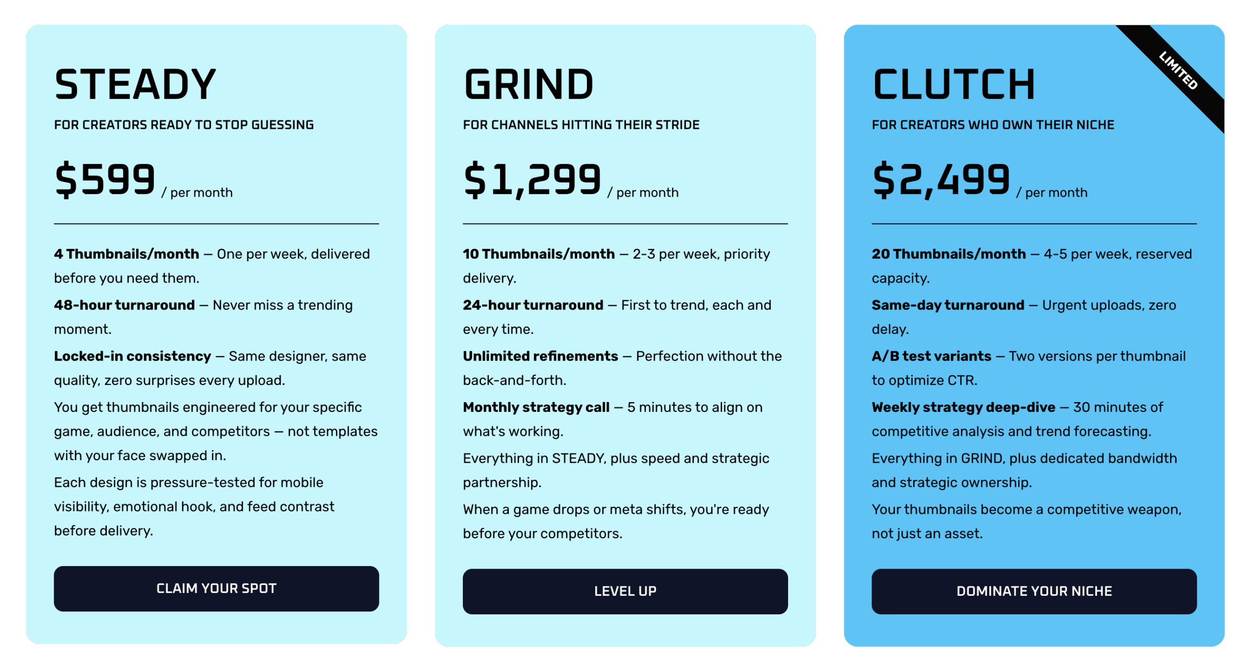
This isn't a one-off checkout. We built three recurring subscription tiers (Steady, Grind, Clutch), a one-time trial for creators who want to test the work first, and an invite-only Partnership tier reserved for a handful of clients at a time.
Every tier runs on its own Stripe Checkout link, so upgrades, cancellations and one-time trials are handled without a single support email.
(Our Strategy)
Nothing on the site is filler. Every strapline and CTA was written with a specific job to do, and out of everything we wrote for him, this line had the biggest one: it doubles as his working philosophy and as the single argument the site needs to make. Say one true thing often enough, in enough places, and it starts doing the selling for you
“Good thumbnails are not creative accidents.”
Three more lines we wrote carry the same weight, each one chosen because it earned its place, not just because it sounded good.
If it does not read at thumbnail size, it does not ship.
Thumbnail design works best as a system, not as isolated images.
Each thumbnail is engineered for your specific game, audience, and competitive landscape.
(Visual Identity)
The whole site follows the same principle as the thumbnails themselves: readable in a glance, no wasted weight. A gaming-display headline face, a clean workhorse body font, and one electric accent colour doing all the pointing.
Typography
Oxanium — Headings
Aa123
Rubik — Body & UI
Aa123
Colour Palette
#fffefe
#101428
#5fc3f6
#c8f6fd
(Project Facts)
Client
HiHendrix
Sector
Ecommerce
Services
Web Design · E-commerce · Hosting
Platform
WordPress · Stripe
Timeline
3 weeks, contact to launch
Live Site
(Next Steps)
We took one designer's process and turned it into a site that sells it.
Yours could do the same.